Lillen Art Blog
- Artist | Illustrator | Characters
- Loves fantasy, horror and magic
- Website: https://artgr.am/LillenArt
How to Paint Fantasy Hair
by Synthia Lillendandie (Lillen Art)
 I painted this chocolate strawberry fantasy hair study recently and I want to share my art process with all of you. Free tutorial!
0. Photo Reference
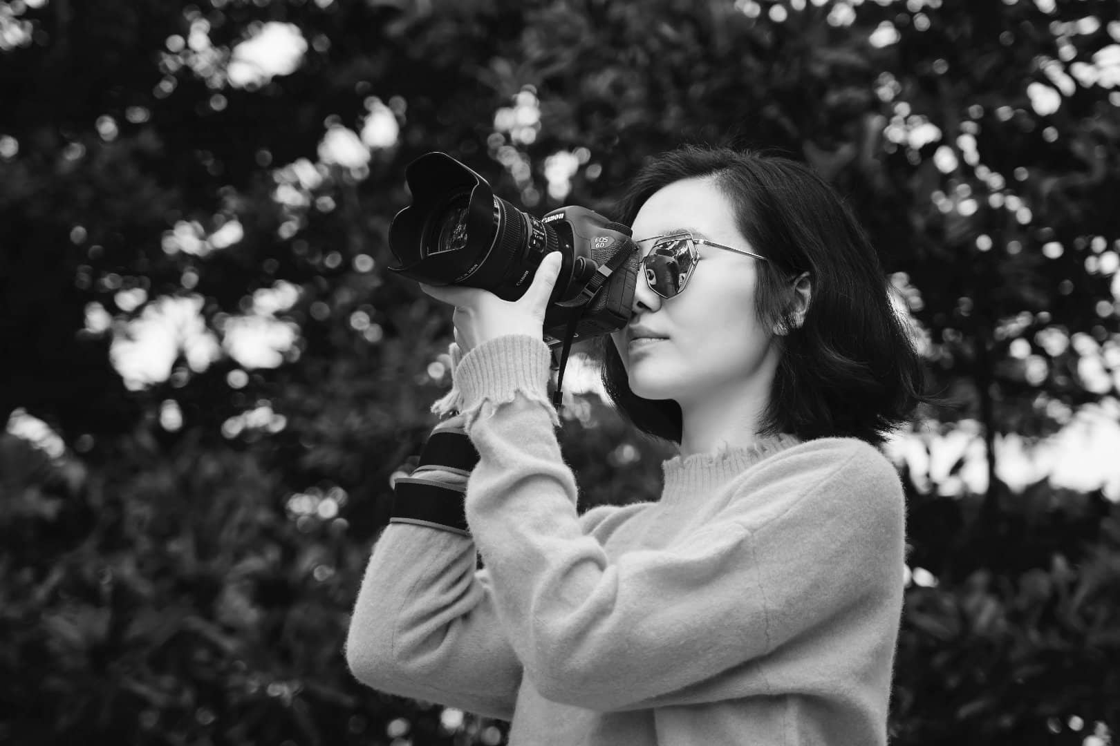 Photography by Marco Xu (Unsplash) (Edited)
Grab yourself a good reference. Look for a photo that catches your interest, that is high res with minimal photo editing (Photoshopping). Make sure there are a wide range of values from dark to light. Natural lighting is ideal. Avoid photos with high contrast from studio lighting blowing out the shadows.
If you’re looking for photos online, I recommend Pinterest instead of Google Images. Pinterest tends to show more aesthetically pleasing images rather than commercialized results. When you find an image you like, it can be easily saved and categorized on different boards. It’s a great tool for keeping track of the various objects your studying, or as a mood board creation tool in the concept design process.
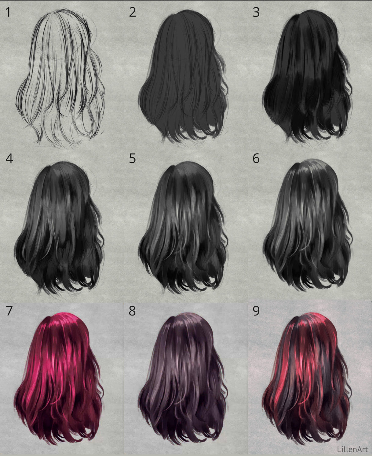
1. Sketch
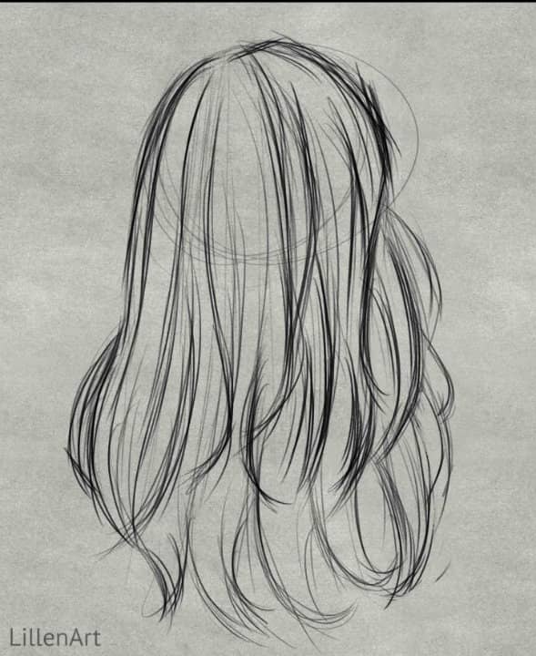 Avoid drawing individual strands of hair. Instead, go for bigger shapes first. Work general to specific.
2. Block In Midtone
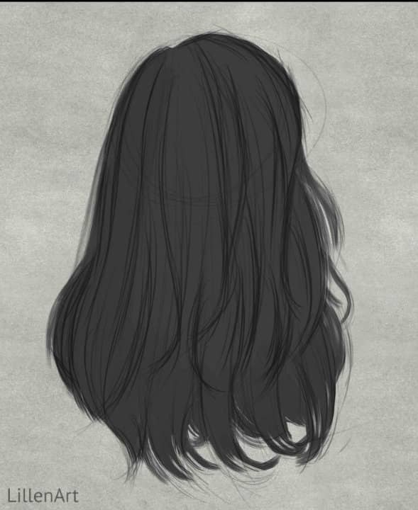
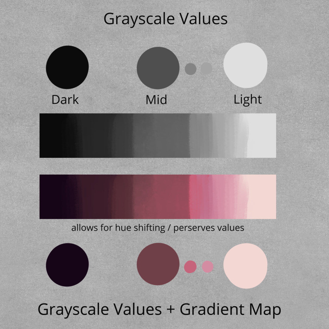
Tip: Turn your photo reference grayscale so you can see the values better.
Select your sketch layer and lower the opacity to about 50%. Set the layer mode to ‘Multiply’. Make a new layer and move it under your sketch layer. Take a good look at the photo and try to guess what the midtone would be. The midtone is the value the base hair color would be without any highlights or shadows. Fill in your sketch with this midtone color.
3. Add Darks
 Make a new layer above your midtone layer. Select a dark value (not black) and begin blocking in the shadow areas.
4. Add Lights
 Make a new layer above your darks layer. Select a light value (not white) and begin blocking in the highlight areas.
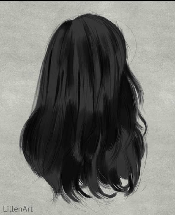
5. Define detail
 The first detail pass. Expand your range of values to include lighter lights and darker darks. Define your soft and hard edges. Use a smaller brush to define the shapes of smaller individual pieces of hair.
Tip: You can lower the opacity of your sketch layer even further (or delete it). I lowered mine until it was barley visible, and erased stray sketch lines that distracted from the silhouette.
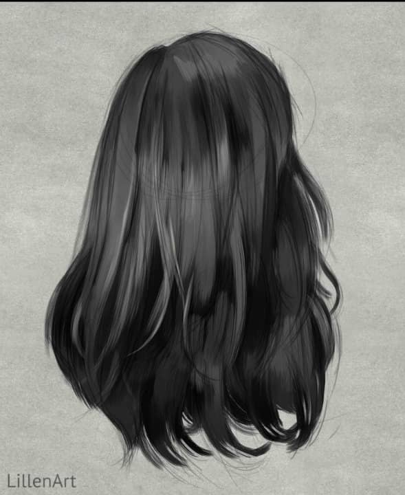
6. Make it shine
 Add the highlights at the crown of the head in a circular motion. Experiment with shine and see what suits your art style. Playing with shine is a nice way to exaggerate character while still keeping things somewhere in the realm of reality.
7. Gradient Map #1
What is a Gradient Map and why are we using them?
A Gradient Map allows you to map individual colors to each of your grayscale values. A gradient map with a variety of colors will look deeper, richer and allow for hue shifting. Gradient Maps also conveniently solve a lot of the issues that typically arise when going from grayscale to color such as, brush strokes not aligning with shadows / highlights / edges, dull and dingy colors, values changing during overpainting, etc.
Tip: A Gradient Map is not the same as the gradient tool. It is a type of layer correction / adjustment.
How do I make a Gradient Map?
Usually you can make a Gradient Map by going to the layers palette > create a new corrective layer > and select Gradient Map.
How you create a Gradient Map can differ slightly depending on your program. If you don’t know how to do this, please look up your specific software. I’ll leave some helpful links below.
- Gradient Maps in Clip Studio: YouTube
- Gradient Maps in Procreate: Youtube
- Gradient Maps in Photoshop: YouTube
Creating the Gradient Map & color layer mode
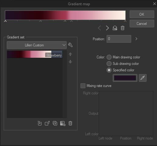
This first map represents the pink streaks running through the model’s hair. When you make your gradient, start with 3 simple values; a dark tone - mid tone - light tone. Move the sliders until you like the result. The great thing about corrective layers is that they tend to be non destructive, meaning that you can tweak them as much as you like should you need to later.
Important: Set your gradient map layer to color mode in the layers palette. If you don’t, the gradient map will override the value layer underneath. The color layer mode allows us to preserve the correct grayscale values.
7.1 Masking (Layer Masks)
In the reference, only a few streaks are dyed pink, not the whole hair. Therefore, we will have to use a layer mask to paint only the areas we want to be pink. Again, how you do this is program specific. I will leave a few links below.
- Layer Masks in Clip Studio Paint: YouTube
- Layer Masks in Procreate: YouTube
- Layer Masks in Photoshop: YouTube
Tip: Usually you can only paint in Black and White on a layer mask. Black = transparent. White = visible. Think of masking as an alternative to selection tools.
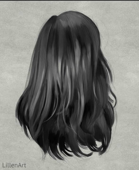
8. Gradient Map #2
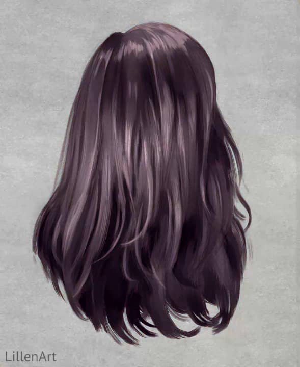
I created another Gradient Map with cooler more purplish tones. This will go underneath the first Map we made in the previous step (7). Having some cooler colors to contrast with the warm bright pink will help to add much needed depth. Try to think about how the hair was cut along with the various pieces and layers. How would the colors shift?
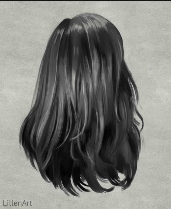
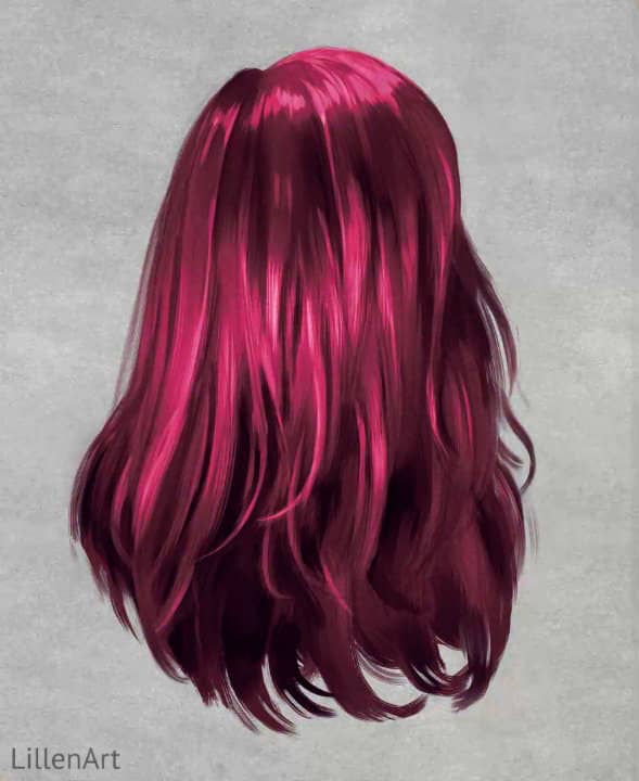
9. Final
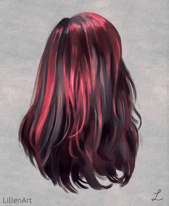
The final result combining everything together. It might look a bit complicated at first with all the subtle color and value shifts, but the more you practice the grayscale / gradient map method the easier it will become.
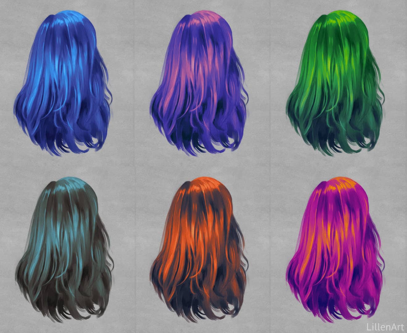
10. More examples
To inspire you, here are a few more fantasy color combinations I created using this method. The possibilities are endless and it’s very easy to test out various color palettes quickly.
Thank you!
Thank you for reading! If you liked this tutorial, please let me know! Your interest encourages me to create more paywall free tutorials. ♡
tags: tutorial - art_process