Lillen Art Blog
- Artist | Illustrator | Characters
- Loves fantasy, horror and magic
- Website: https://artgr.am/LillenArt
Hajimaru - Art Process & Tutorial
by Synthia Lillendandie (Lillen Art)
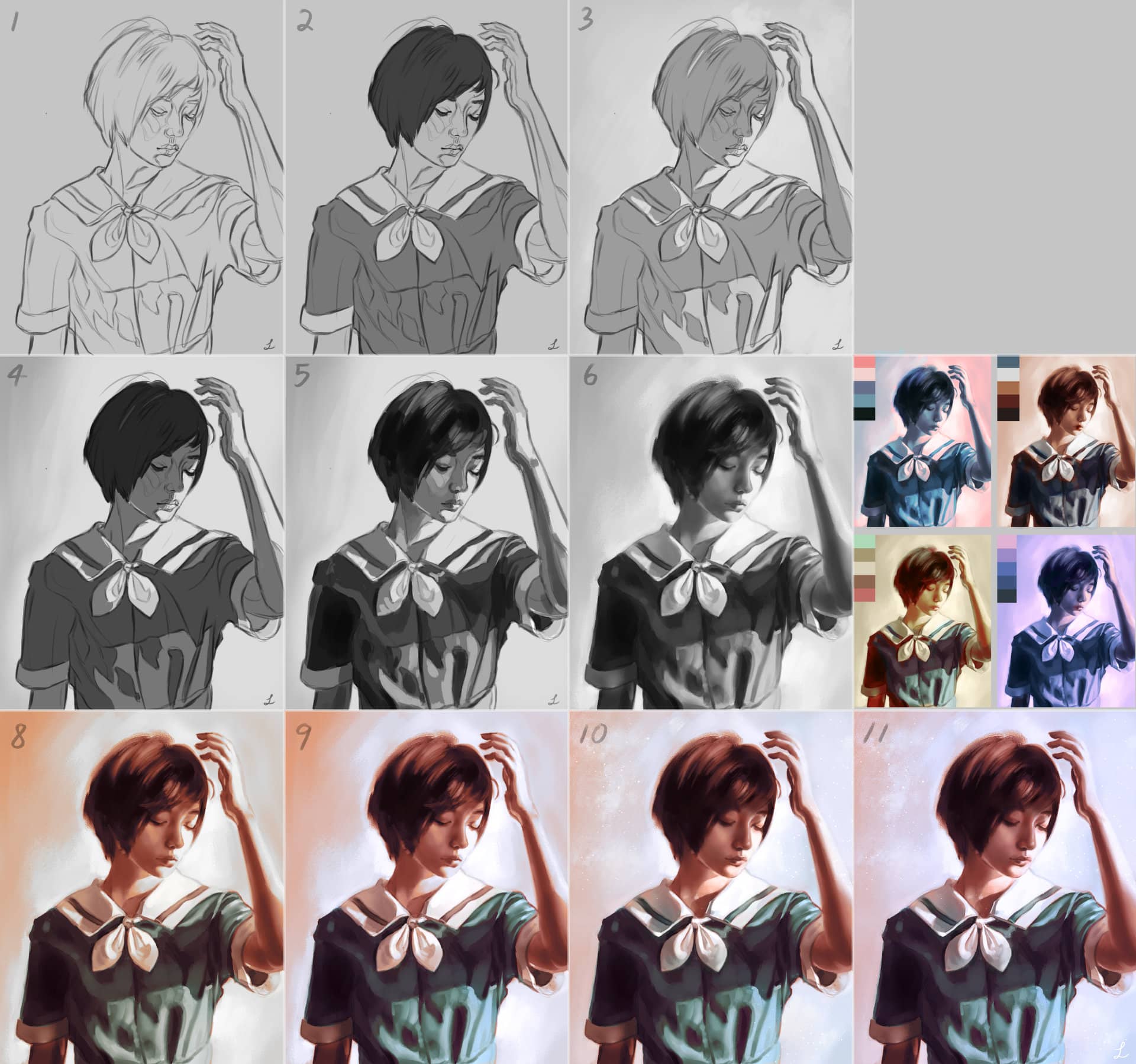
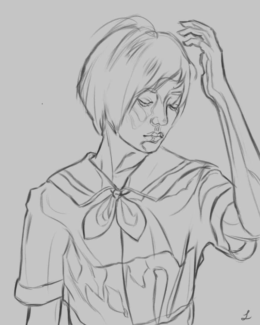
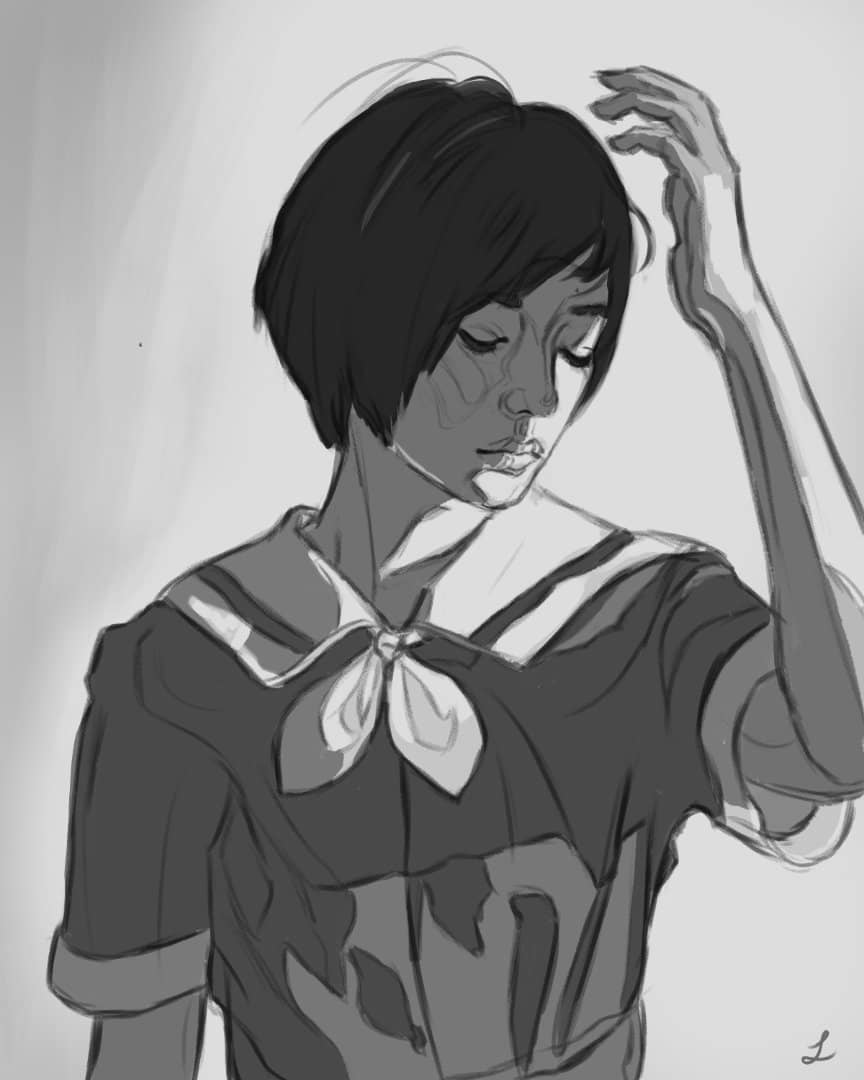
1. Sketch
Start with a really rough sketch. Then lower the opacity of the rough sketch layer, make a new layer, and begin a more detailed sketch. If you’re not confident in your observational skills, you can use a grid to help you eyeball where the features are. Keep the sketch layer at the top with the layer mode set to ‘Multiply’.
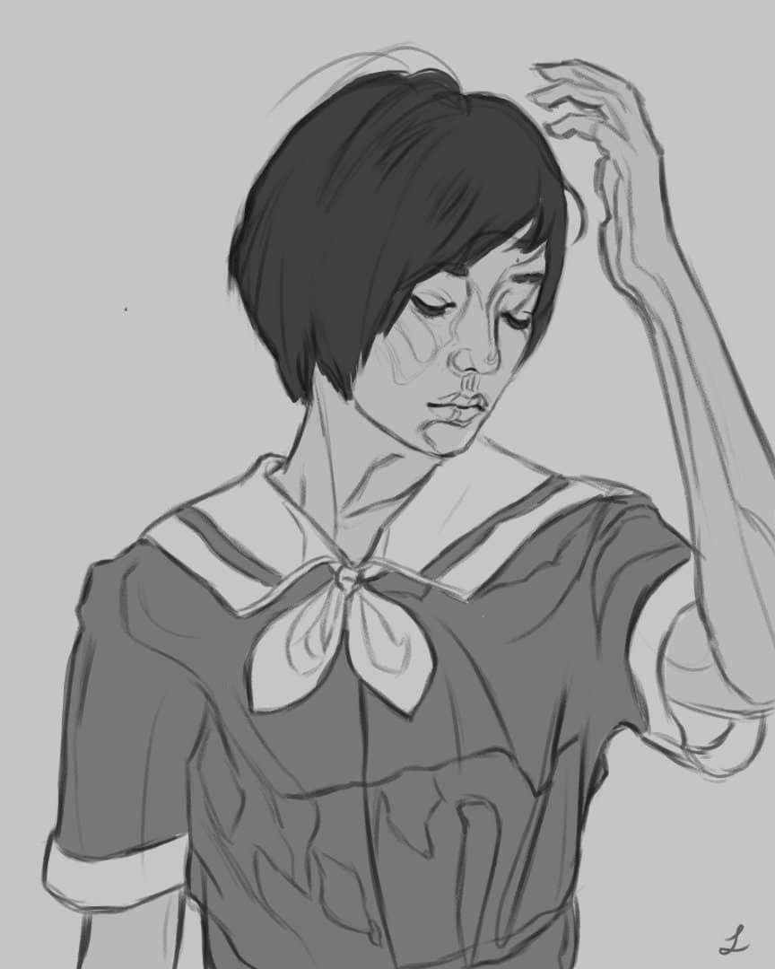
2. Local Tones
The local tone is basically the black and white equivalent of an object’s local color. What is local color? Local color is basically the native color of the object without any interference from direct or ambient light and shadows. I make a new layer under my sketch layer and pick 2 to 4 tones for this part to keep things simple. Use your mid tone to gauge how dark or light an object should be.
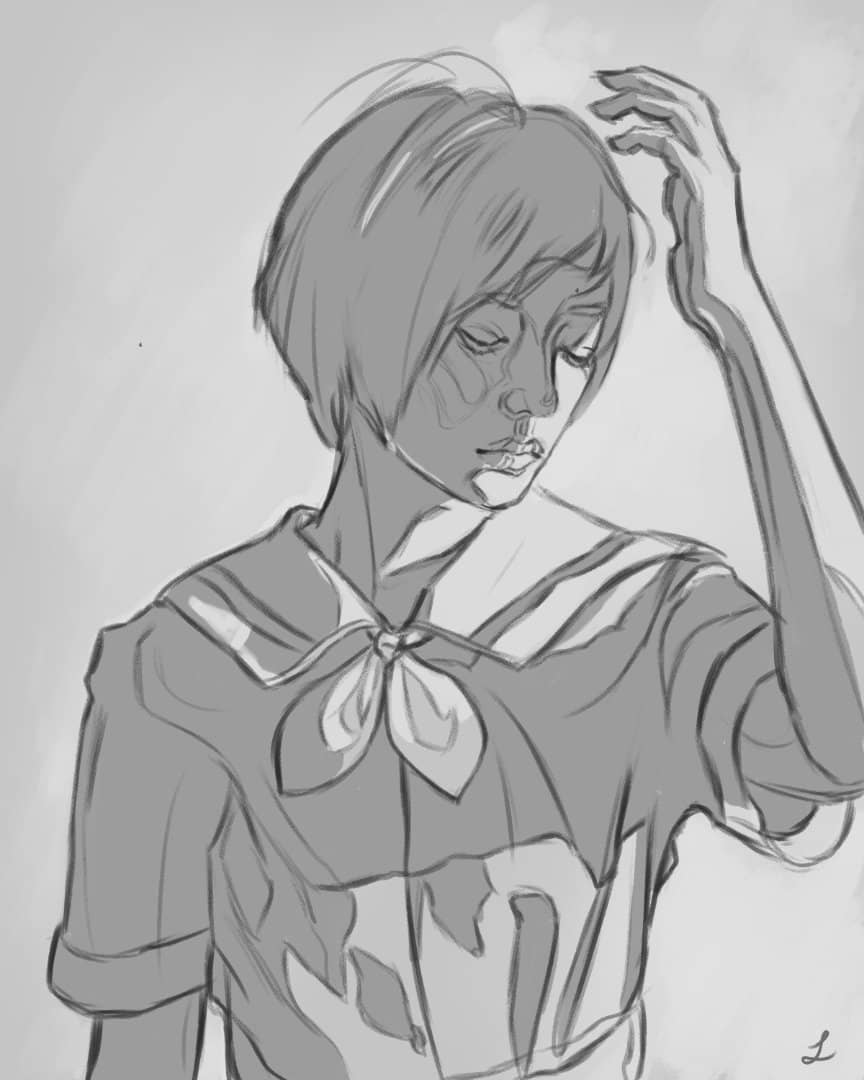
3. Grouping lights & shadows together
On a separate layer, I use only 2 tones to group all of of the shadows and highlights together. I recommend using a harder brush to start with and don’t worry about blending yet.
Some artists like to use specifically the darkest dark tone and the lightest light tones for this step. I prefer to build up my values gradually so I started with a pretty light value for the shadows. Either way works fine. For the background, I used a soft a brush to lightly indicate the light so things wouldn’t feel as flat.
4. Tones & Lights / Shadows Combined
Step 2 & 3 combined together. It’s a pretty good base to work from and now the over all values for the figure have been established.
5. Adding In between Values
Pick 2 - 3 more tones and start adding the in between values, darker darks and lighter lights. At this point, I’m still using a fairly hard oily brush with a little bit of texture. I try not to blend / use blending brushes or super soft brushes. I recommend staying fairly zoomed out and resist zooming in too closely. The goal is not fine details, but rather getting our values down accurately. Note: This is usually where the ‘ugly stage’ happens for most of my paintings, so if you start to get discouraged, don’t give up. Keep pushing through it will be worth it.
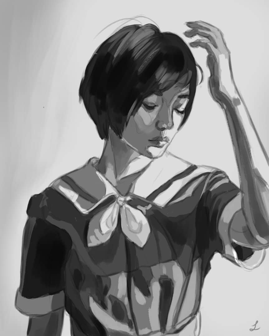
6. Define Edges
This is one of the biggest and most important steps: edges. In my previous tutorials I don’t think I stressed just how much time, effort and knowledge it requires to define your edges. If you are new to painting, I absolutely recommend you learn about the different types of edges first.
This is where I will start lowering the opacity of my sketch layer. I will usually take all the layers underneath my sketch layer (making sure to keep the sketch layer separate) and ‘merge visible to new layer’. I begin blending using a combination of blender brushes and soft brushes to soften my edges and imply a bit of ambient occlusion and reflected light. It’s okay to zoom in a bit more and start defining eyes, nose, lips, etc.
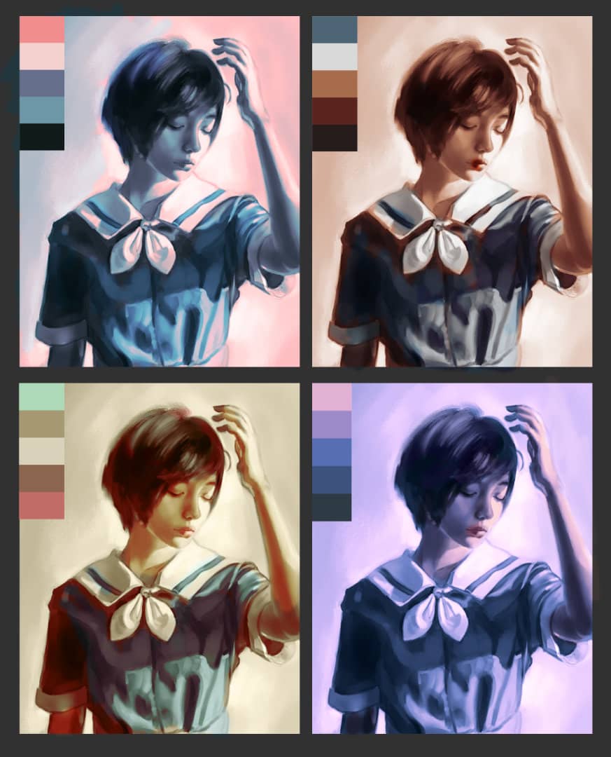
7. Color Thumbnails
I used Adobe Color to come up with 4 color palettes I thought would work and tried them out roughly. In the past, I would jump straight into color without thinking about it much, but I think planning has much better results. After some consideration, I decided to combine aspects of palette #2 and #3. Originally, I was planning on using palette #4, but I it’s a bit too monochromatic compared to the other themes.
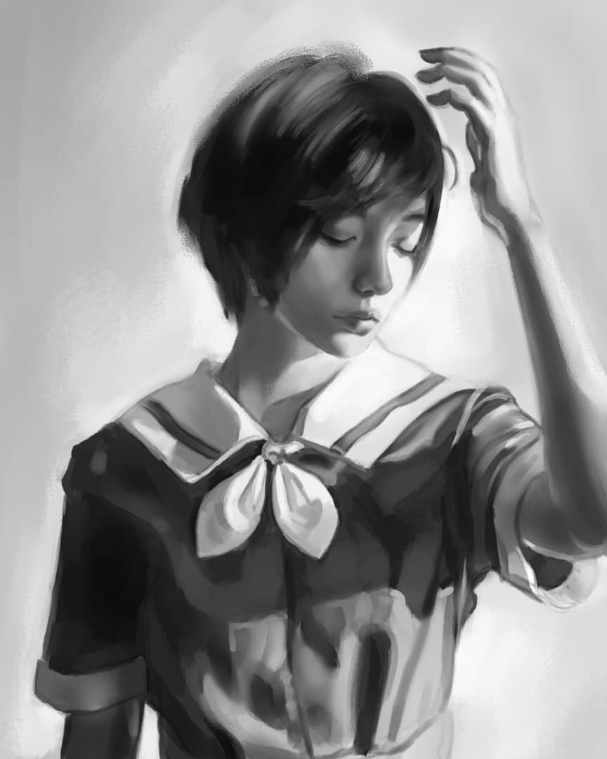
8. Applying Basic Colors
Now that we have a solid foundation of values and edges, we can move on to color, but it’s important to keep what we’ve already established. I don’t like painting over the value layer or using multiply / overlay layer modes because they can easily destroy your values. In addition, simply adding a color layer over black tones can make the end result look gray and lifeless. If you want a visual example of the issues with grayscale, I recommend watching Marco Bucci’s ‘Grayscale to Color’ as it demonstrates some of these problems and more.
One good solution to these issues is to use Gradient Maps. As opposed to using a dull color wash over gray values, Gradient Maps allow the artist to ‘Hue Shift’, selecting individual colors that correspond to each of the values.
In this example, I merge all the layers together and duplicate it. Take the top layer and create a gradient map. Try out different colors based on your pre-selected palette. It may take a few tries to get the right combination of colors. Slide each individual color around to try and match it to the corresponding value.
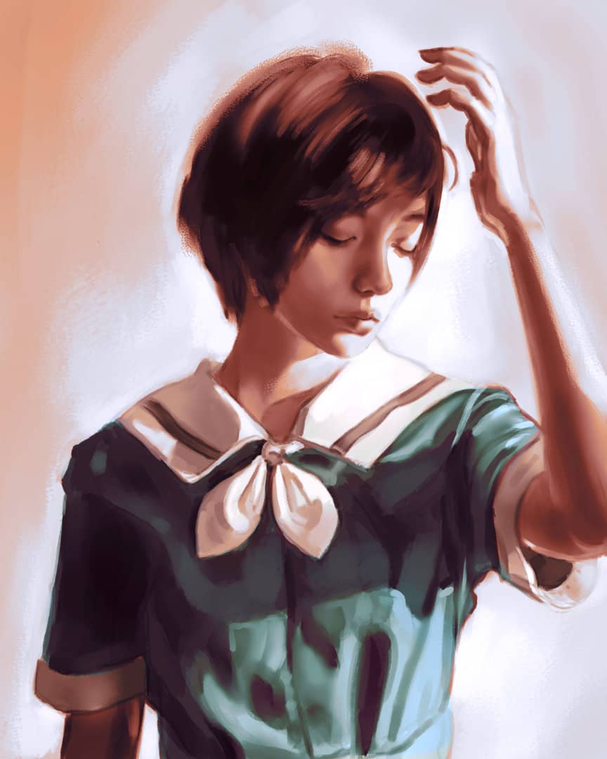
9. Building colors & Adjustments
The color palette here has a warm (orange) - cool (blue) dichotomy which is nicely balanced, but it’s not a bad idea to choose a main color that can be used to draw emphasis.
Normally for a portrait painting, it’s a good idea to draw attention to the face as it’s naturally where the human eye tends to be drawn. However, I decided to go against the grain and make the blue shirt the main color. With adjustment layers you can easily increase the vibrance and saturation.
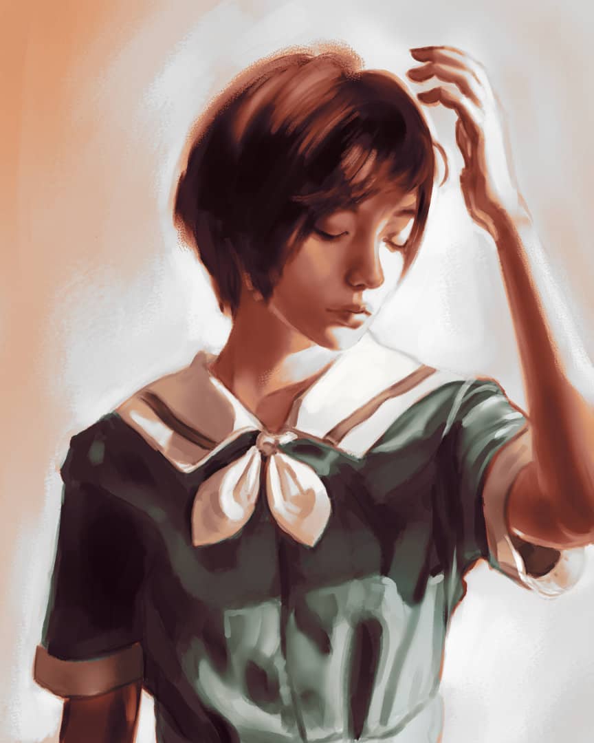
10. Detailing & Making Corrections
I refined my edges and colors even further on the collar, nose, lips, eyes, chin, arm and fingers. I select colors off the painting itself by a hotkey set to a button on my pen. When detailing, focus on the areas where people tend to look. Avoid drawing every strand of hair. Darker objects, especially those in shadow, can be less detailed. Light objects, like the white fabric in the collar, reflects the nearby colors like the blue shirt and the warm shadows.
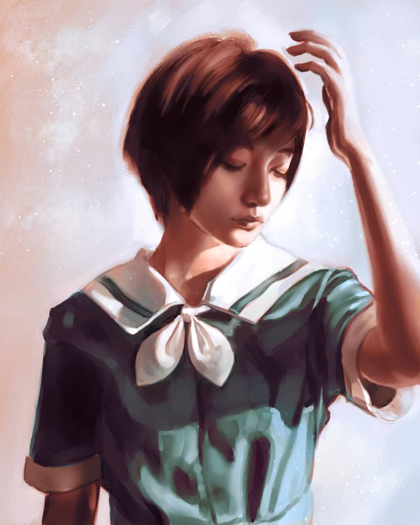
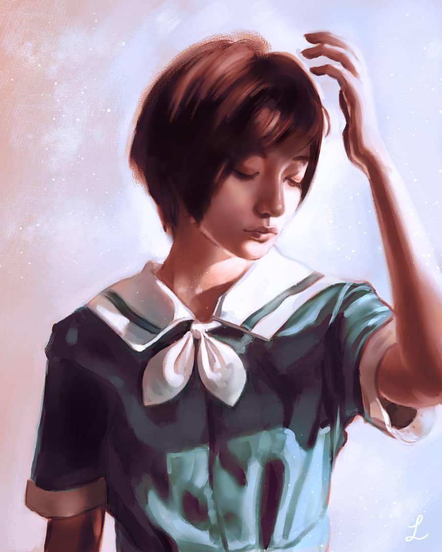
11. Final image & Post Processing
I typically adjust things like levels, vibrance, saturation, white balance, etc. The most notable change here was shifting the colors in a cooler direction. This was done because the skin was looking a bit too orange and unnatural. Also, I think the shirt looked better with less cyan.
Thank You!
If you’ve enjoyed this tutorial, please link and share with a friend. Thank you for reading!
tags: tutorial - art_process